Q: If I want to look at graphs of COVID-19 cases and compare across countries, should I look at graphs that are adjusted for country population size (for example, number of cases per 100,000 people) or just the total number of cases?
A: Hey, whatever floats your boat, we won’t judge, but there’s a good argument for the total number of cases (*not* adjusted for country population size) graph providing more useful information.
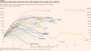
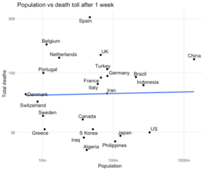
John Burn-Murdoch, Senior Data-Visualisation Journalist at the Financial Times (cool title!) is a strong proponent of the total cases approach (see his recent graph of cases on the top), and supports this choice with the scatterplot on the bottom: that plot shows almost no relationship between country population size and number of cases.
“Population does not affect pace of spread. All per-capita figures do is make smaller countries look worse”, he tweeted a few weeks ago.
He went on:
“Plenty of things indirectly related to population can make a difference:
- Pop density can increase rate of spread
- Countries with many major travel hubs may end up with multiple outbreaks
But pop alone is a bad thing to adjust for if wanting assess how bad an outbreak is.”
Burn-Murdoch also announced today that the Financial Times will be shifting its focus on reporting COVID19 mortality to excess mortality experienced by countries and regions during this period compared to earlier periods. Stay tuned for a follow-up on this metric.
The Financial Times has made much of their COVID-19 coverage free to read, and it’s a great source of clear and compelling “data viz”.
Financial Times free COVID-19 coverage